
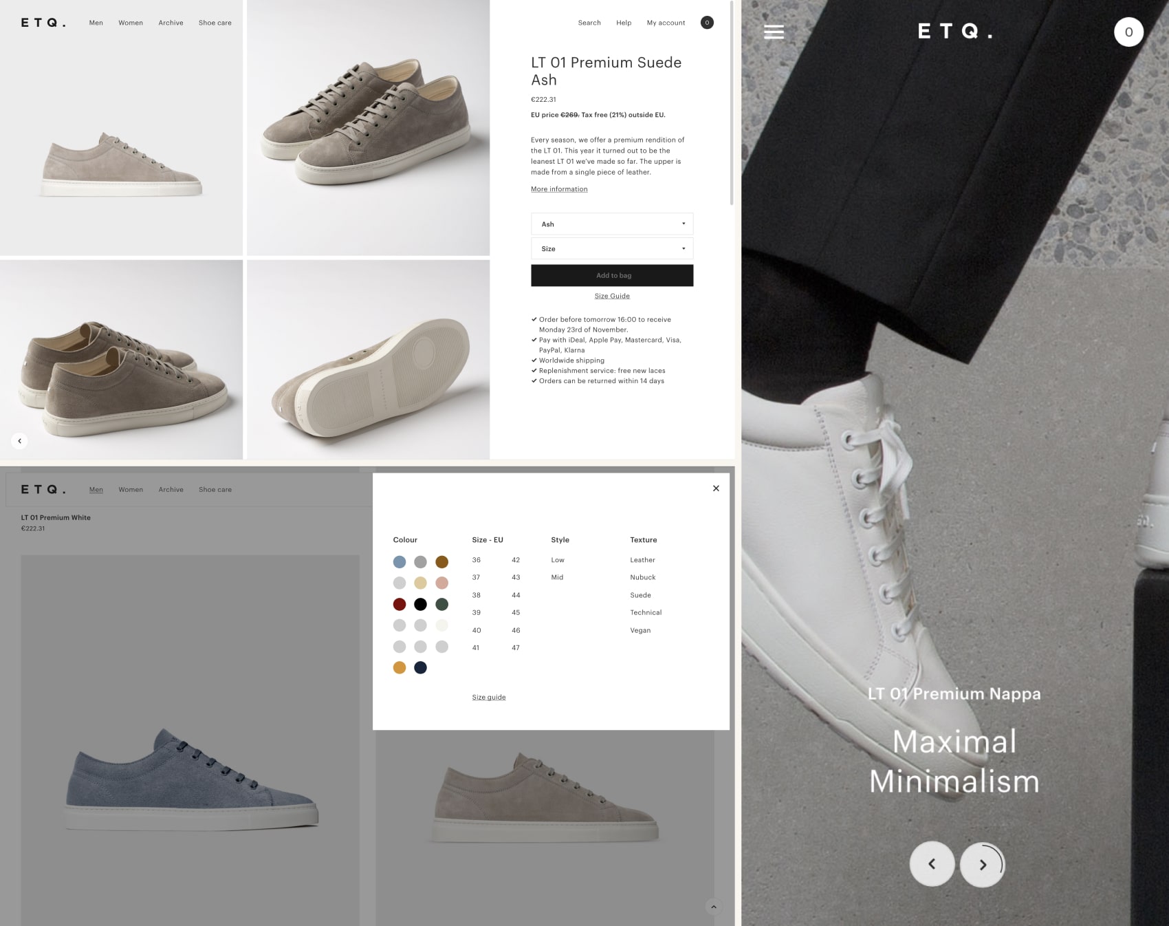
Good e-commerce design does more than look nice. It removes every reason a visitor might have to leave before buying, and it does that differently for every product. A sofa, a fragrance and a bike pedal ask completely different questions of the person looking at them.
We revisited this list in 2026 and checked every store again. Some changed a lot since our first version, one closed, and the lessons got sharper. Here are ten online stores that get the balance right, what makes each of them work, and what any business can borrow.
ETQ
ETQ Amsterdam
ETQ sells men's footwear and wardrobe essentials, and its homepage says almost nothing, on purpose. A large product photo fills most of the screen; a narrow white column carries one line, "Worn daily. Built to last.", a 4.6 out of 5 rating with a note that more than 250,000 customers trust the brand, and a single "Shop all" link.
The navigation is four words long: footwear, menswear, accessories, sale. That restraint is the positioning. A brand built on essentials does not need ten menus to prove it.
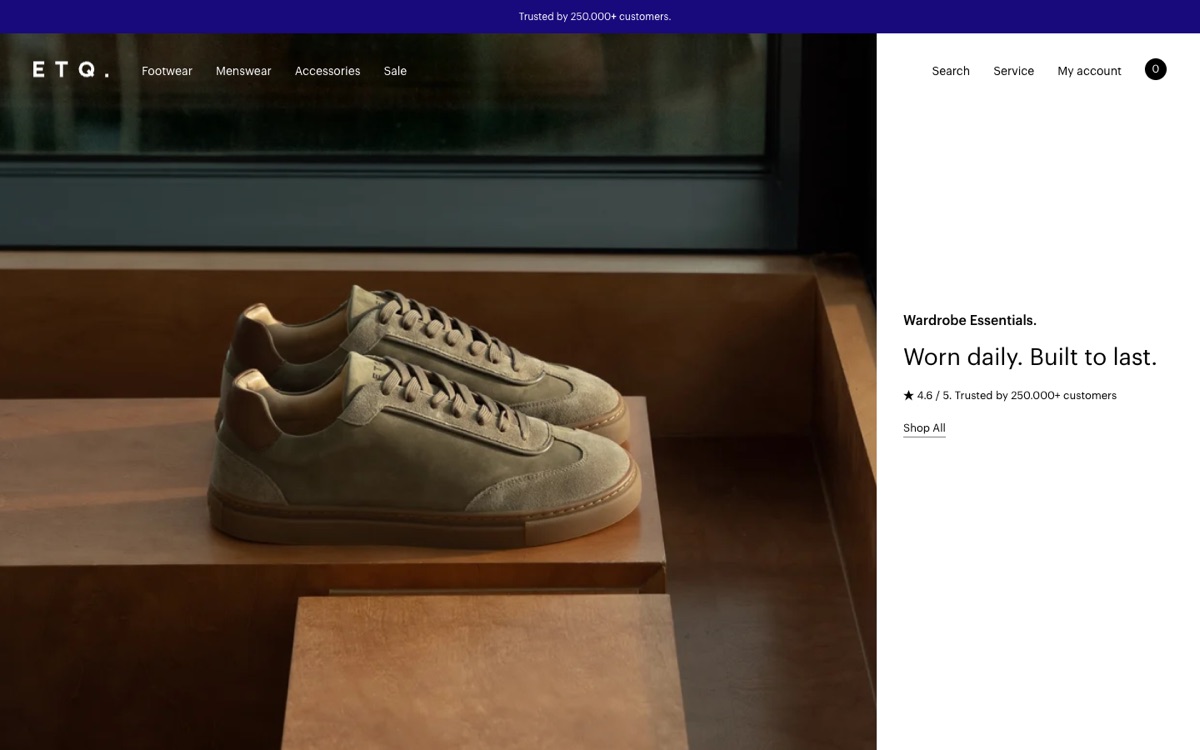
What to borrow: put social proof in the first screen, next to the promise, not three scrolls below it.
RED EDITION
Red Edition
Red Edition designs furniture, and its site shows furniture the way people actually buy it: inside a room. The homepage opens on full-width interior photography, a velvet sofa in daylight, with a quiet slide counter and one word, "Discover".
The menu has a separate path for professionals next to the consumer collections. Architects and interior designers get their own entrance instead of hunting through a retail catalog.
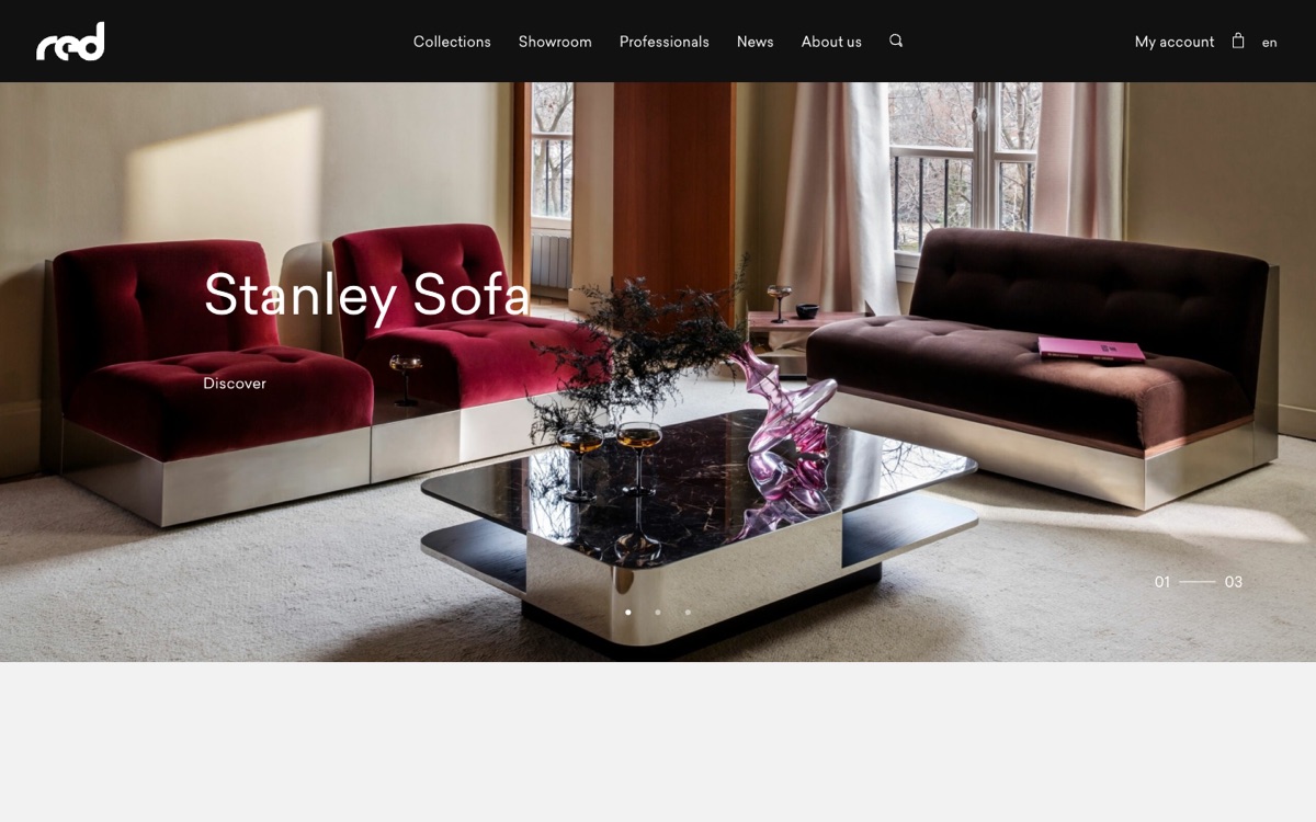
What to borrow: if you sell to two audiences, give each its own door.
BALENCIAGA
Balenciaga
When we first wrote about Balenciaga, its store was famous for brutalist black lines and neon buttons. In 2026 it looks almost the opposite: white, uppercase, calm, with one campaign image and one button.
The most telling detail is a full-width search bar right under the menu, "What are you looking for?". A luxury house with a huge assortment made search the main tool, ahead of the menus.
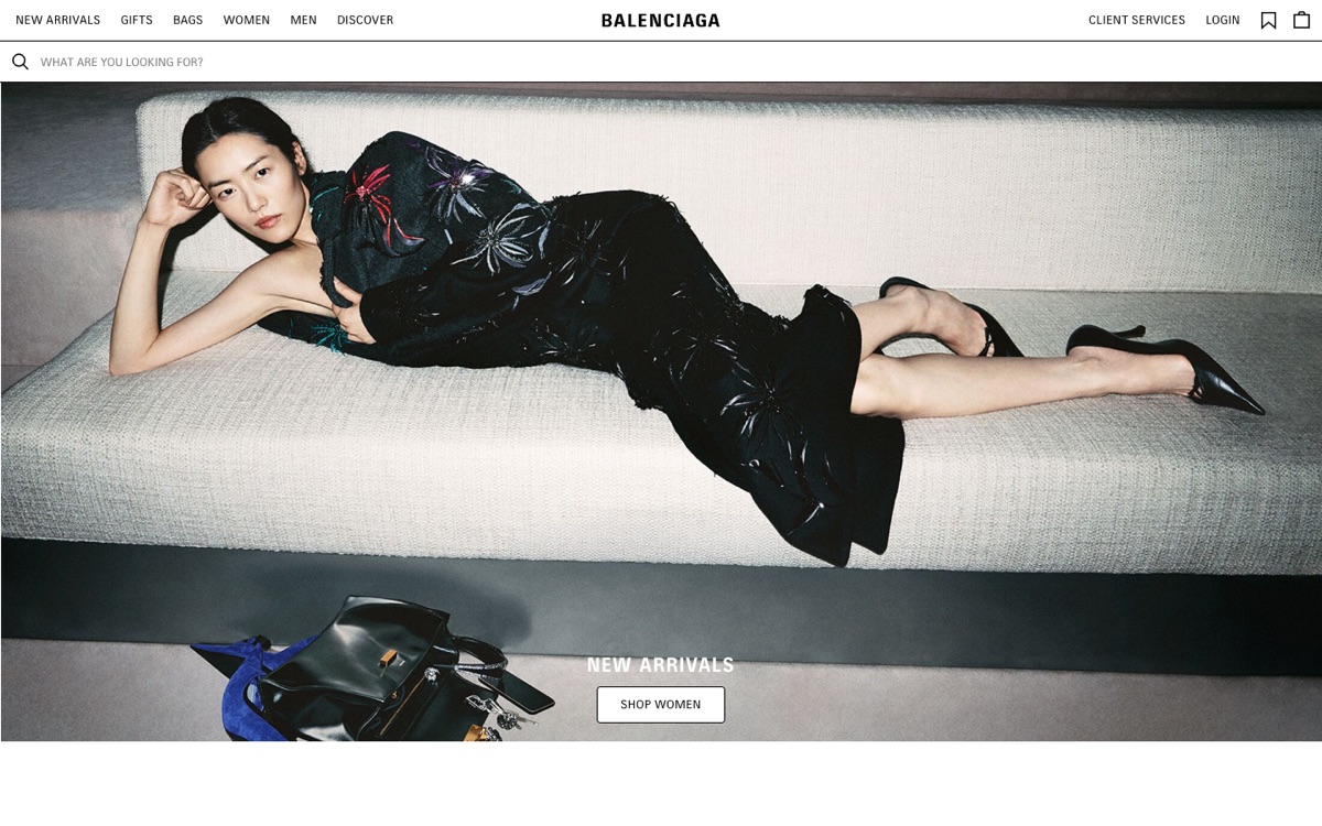
What to borrow: a strong brand can change its visual language completely and stay recognizable, as long as the change has a reason.
AESOP
Aesop
Aesop replaced Itemerie on this list, which is no longer online. The skin and body care brand runs one of the most consistent stores on the web: warm off-white backgrounds, amber bottles photographed the same way every time, and calm, almost literary copy.
Look at how it sells sets. Each one has a name, a one-line description, a price and a single "Add all to cart" button. The menu also carries a "Library" next to the product categories, so content lives inside the store instead of in a separate blog nobody finds.
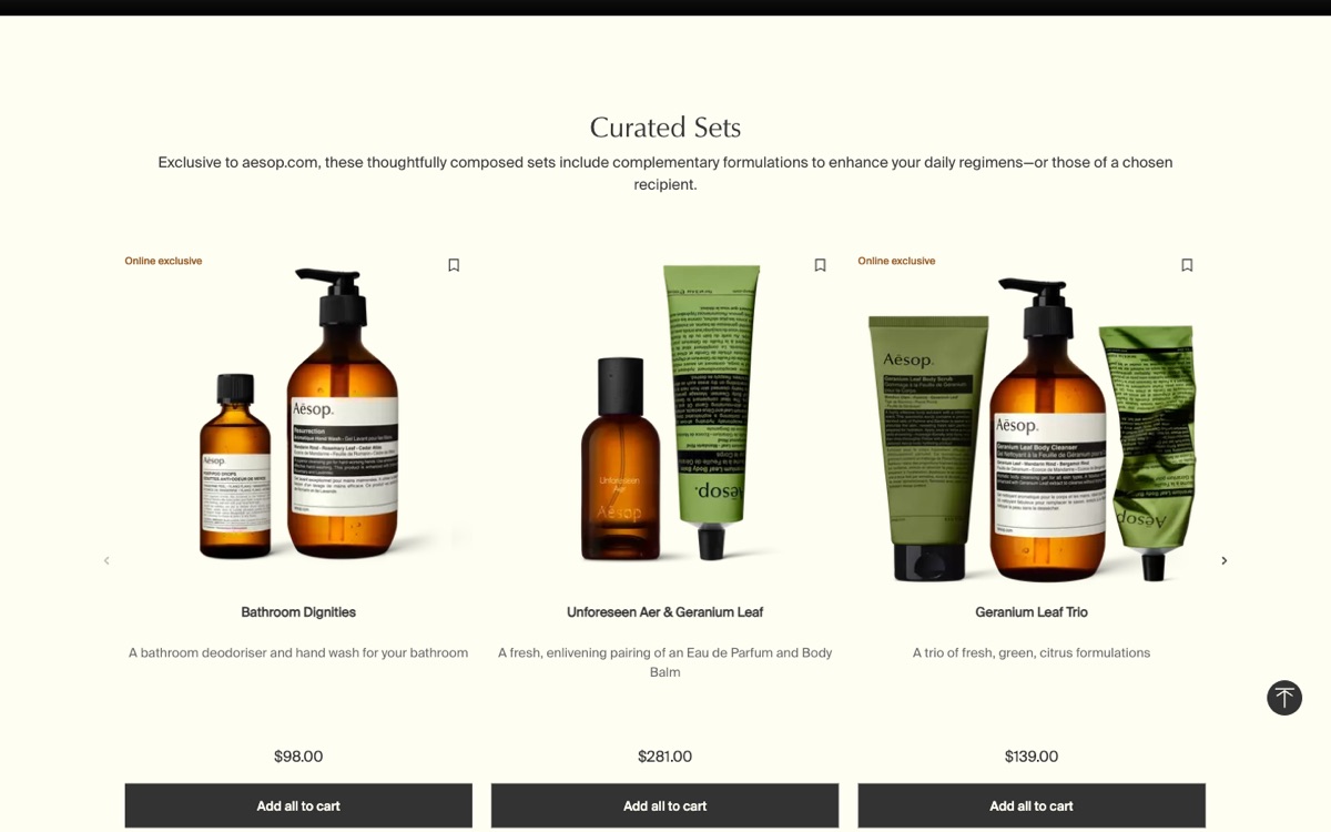
What to borrow: curated sets raise the order value without a single discount.
MENDO
Mendo
Mendo is an Amsterdam bookshop and publisher, and its site treats every book like a design object. The homepage is a split screen: a bold headline and a black "Out now" button on one side, the book itself on a flat color background on the other.
A currency switch sits in the top bar, which quietly tells international buyers that the shop ships to them.
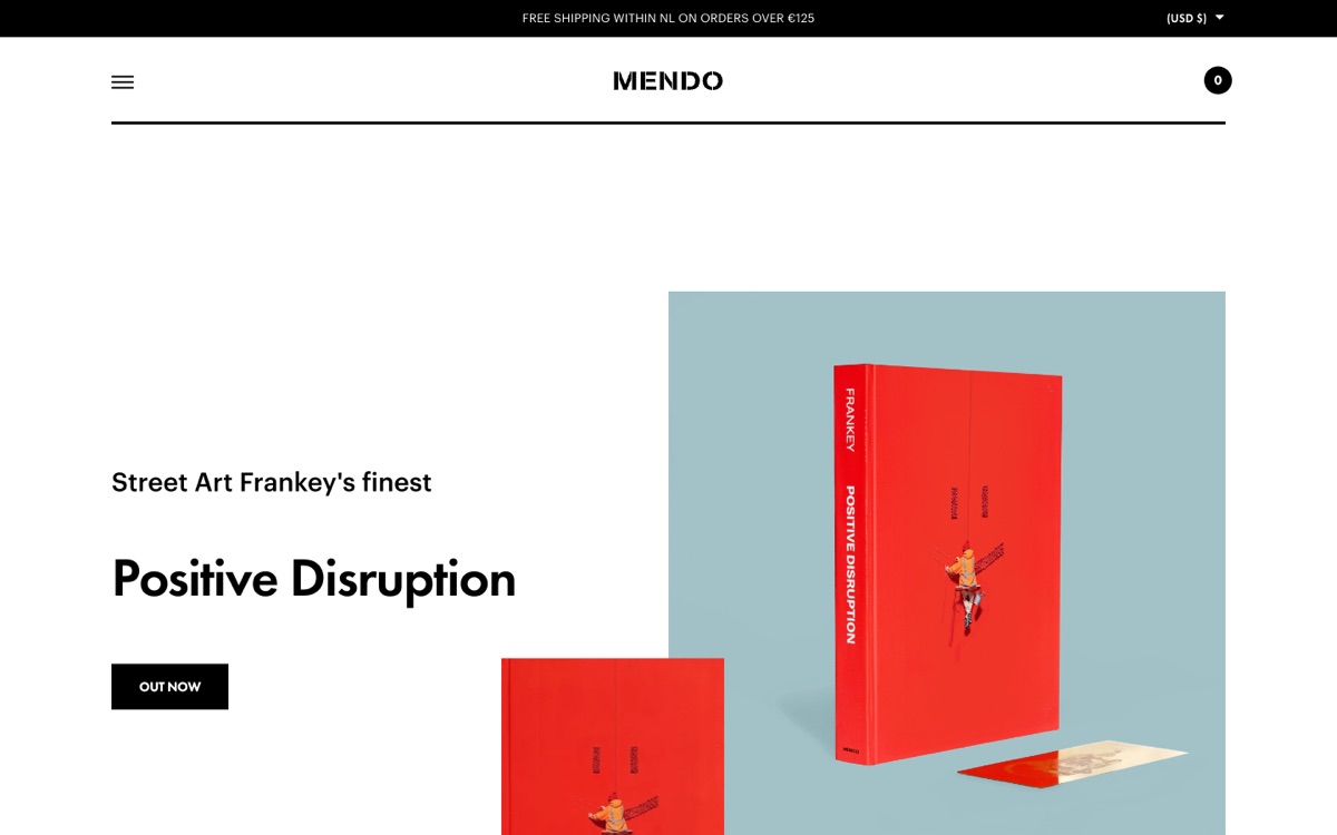
What to borrow: when the product is visually strong, let it be the hero and keep everything else typographic.
ADIDAS
Adidas
Adidas works at a completely different scale, and its design problem is not looks, it is findability. The header carries the main split (men, women, kids, sale, sports, new and trending), a large search field, and a second row of service links: store finder, help, orders and returns.
The hero uses three side-by-side images for one collection, so a single campaign gets the whole screen without a slider that people skip.
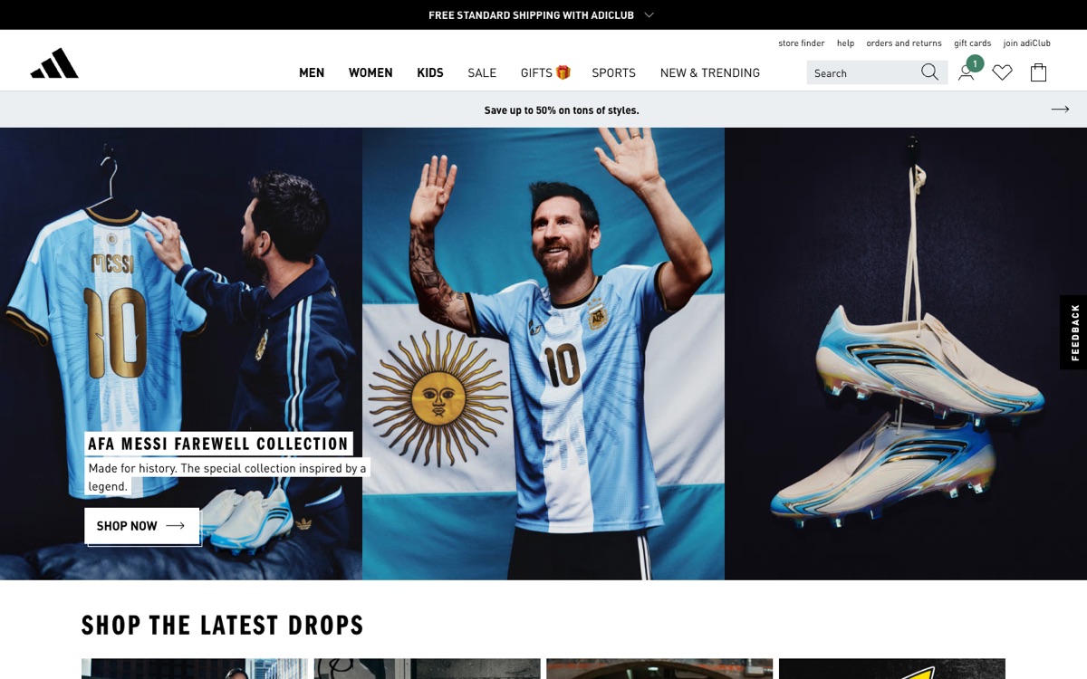
What to borrow: on a large catalog, navigation and search are the design.
SEEDLIP
Seedlip
Seedlip sells non-alcoholic spirits, a category that has to explain itself before it can sell. The homepage answers the obvious doubt in four words, "Yeah, it's a drink.", over a cinematic shot of a cocktail and the bottle.
Recipes sit in the main menu, right next to the shop. For a product people do not know how to use yet, the recipe is the sales page.
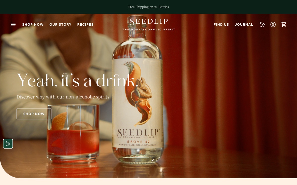
What to borrow: if your product is new, education is your conversion path.
RACE FACE
Race Face
Race Face makes mountain bike components and speaks to riders, not to everyone. The homepage is black, with saturated product renders (pedals, grips, a stem) floating around one confident line, "Your bike deserves a colour story."
Technical detail is not softened for outsiders. A region and currency switch sits right in the header, because the audience is global and knows exactly what it wants.
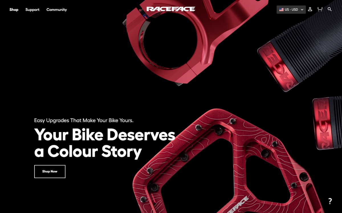
What to borrow: design for the buyer you have, not for a general audience you imagine.
SENTEURS D'AILLEURS
Senteurs d'Ailleurs
Senteurs d'Ailleurs sells niche fragrance and cosmetics and runs a beauty institute. The site is built like a printed catalog: thin rules, a serif display face, an engraved perfume bottle as an icon, and photography with real texture.
The most practical detail is in the menu: samples. Fragrance is the one thing e-commerce cannot convey through a screen, so the store lets people try before they commit.
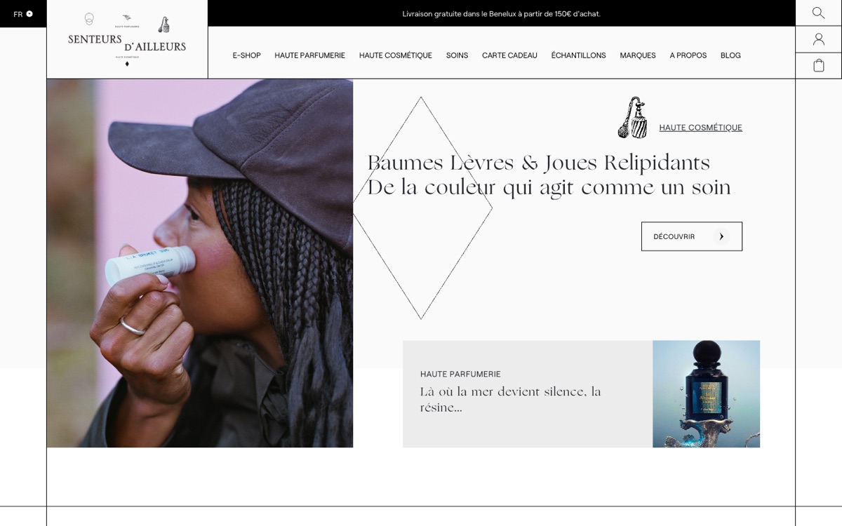
What to borrow: find the step your product cannot do online and design around it.
EVERYDAY NEEDS
Everyday Needs
Everyday Needs is an independent homewares and design store, and its site is as understated as its name. A warm, natural-light photo of objects on a wooden table, a small wordmark, and a short menu that includes "The Makers", stories about the people behind the products.
Nothing on the screen competes for attention. It is a useful closing example because it is not flashy: sometimes the most effective store design is the one that gets out of the way.
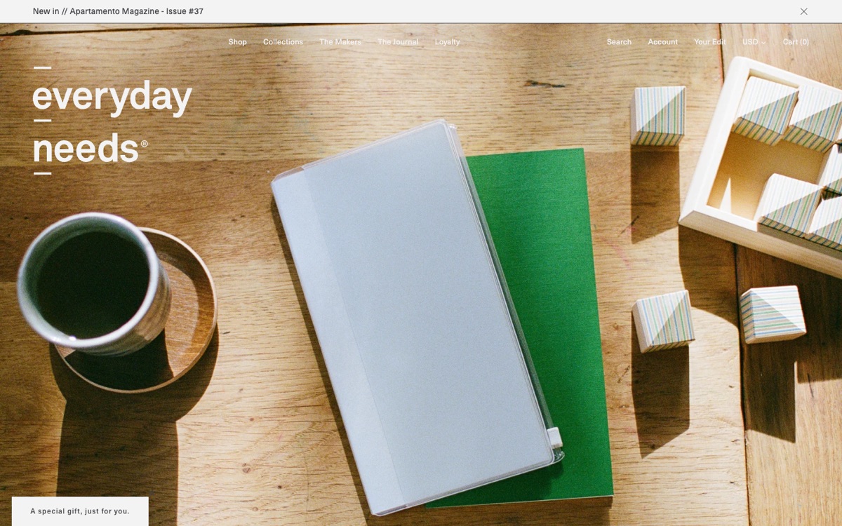
What to borrow: the story of who made the product can sell better than any banner.
WHAT THEY SHARE
What These Ten Stores Have in Common
Different products, different price points, different countries. The same principles show up in all ten:
- Photography matches the real selling point: a room for furniture, texture for fragrance, the product itself for a bold object.
- Navigation is sized to the catalog: four words for ETQ, a full system with search for Adidas.
- The first screen answers the main doubt: "Is it worth it?" with a rating, "What is this?" with a recipe.
- A bold identity never makes checkout harder. Personality lives in the visuals, not in extra steps.
Good store design is not one look. It is whatever removes the most friction for that specific product and that specific buyer. We go deeper into this way of thinking in How We Design E-Commerce: From Objects to Experience, and into why premium stores break the usual rules in Why Luxury E-commerce Breaks Every Rule of Conversion Optimization.
OUR PROJECTS
How We Apply This in Our Own Projects
These are not abstract lessons for us. The same principles shaped the online stores we designed and built:
- SHTAYER: an e-commerce platform that serves both retail customers and hotels buying in bulk, rebuilt around a new brand identity.
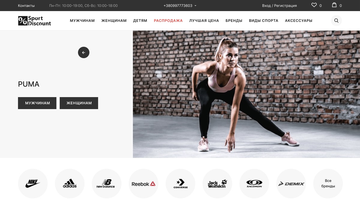
- Sport Discount: a redesign of a large sporting goods store based on heatmaps and analytics instead of opinions.
- Bags etc: an online store for a leather goods maker, where the site had to finally match the quality of the product.
- Spex: a UX/UI concept for luxury eyewear, closer to an editorial experience than to a standard catalog.
If a store looks good and still does not sell, the reason is rarely the colors. We wrote about that in Why Some Websites Look Cheap Even When They Are Well Designed.
Planning a new online store or a redesign? A Strategic Session is where we map your product, your buyer and the friction between them, before anyone opens a design tool.
- Share
-

-

-

-